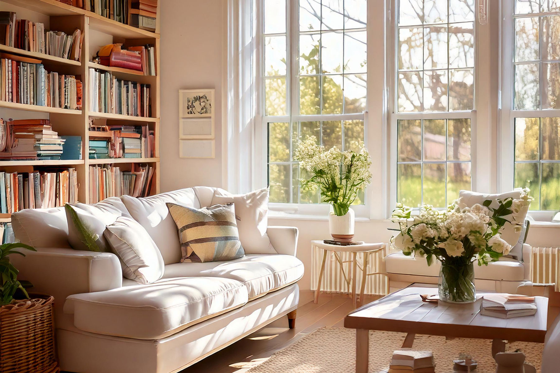
Color Me Happy: The Power of Color Psychology in Home Decor
Color psychology in home decor is a fascinating intersection of science and art. It shows us that the different hues we see around us aren’t just shades on a spectrum. I mean, really, there’s literally so much more to color than meets the eye. (Pun intended!)
Here’s why you should hue me out! (Okay, last pun for now!)
Research has found that colors are quite influential, and the ones we use in our homes have the power to influence our mood, behavior, and even our mind and body.

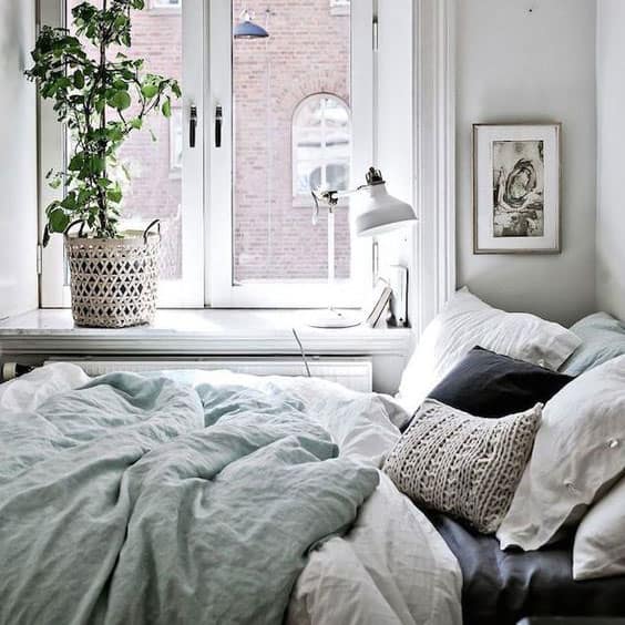
Take the colors blue and green for example. These colors are found in nature and are known to have a calming effect. It’s one of the reasons why designers and decorators recommend them for bedrooms and relaxation spaces.
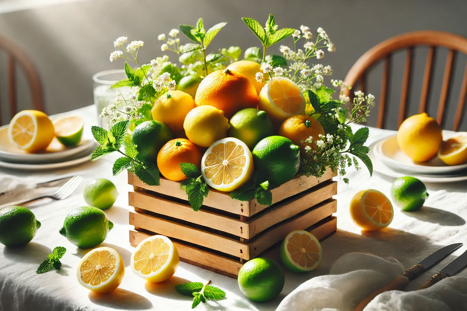
On the other hand, brighter colors like red and yellow increase energy and appetite and are often suited for social spaces like kitchens or dining rooms. (This also explains why we lean towards a bright kitchen that is open and inviting!)
So, is color psychology really that important?
Well, science seems to think so. Studies in Color Research and Application Journal show that certain hues are linked to specific emotional responses. For example, blues are associated with calm and trust, while warm tones evoke excitement and warmth.
So before you pick your next room color, should you consider the science behind it?
I believe you should.
Should You Give Color Psychology a Second Thought?
Colors can influence how we feel, how we experience spaces, and even how we behave. And so, the right colors in home decor, can help you set the tone, create harmony, and transform a room from plain to extraordinary.
And while many people instinctively recognize that some colors affect their mood, choosing the right hues for their home can feel like a daunting task.
I mean, how many times have we fallen in love with a color sample only to be disappointed after it’s been painted all over?
And this is where the science steps in to help you understand and choose shades that will enhance your home’s aesthetics.

The Basics of Color Theory
Color theory is like the instruction manual for how we see and interpret colors. (You could think of it as a cheat sheet for understanding why certain colors “go so well” together while others just seem to bring out the ugliness in each other.)
And the foundation of color theory is the color wheel.
This circular chart organizes colors into primary, secondary, and tertiary categories:
- Primary Colors: Red, blue, and yellow. These are the building blocks of all other colors. You can’t make these by mixing other colors.
- Secondary Colors: Green, orange, and purple. These can be made by mixing two primary colors.
- Tertiary Colors: These blend a primary and a secondary color and create hues like red-orange or blue-green.
By using the color wheel as your guide, you can create combinations that make any space feel intentional and harmonious. That means no more guessing games—just beautiful, balanced decor that’s pleasing to the eye!

How Does Color Temperature Impact Mood?
Ever walked into a room and felt instantly cozy or calm? That’s the color temperature at work.
‘Temperature?’ you may ask.
Fair question. Technically, when we say ‘color temperature’ we mean warm or cool. All colors can be categorized into two main groups:
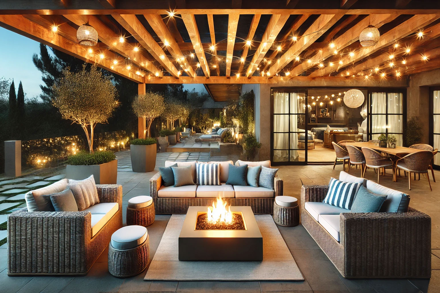
- Warm Colors: Reds, oranges, and yellows.
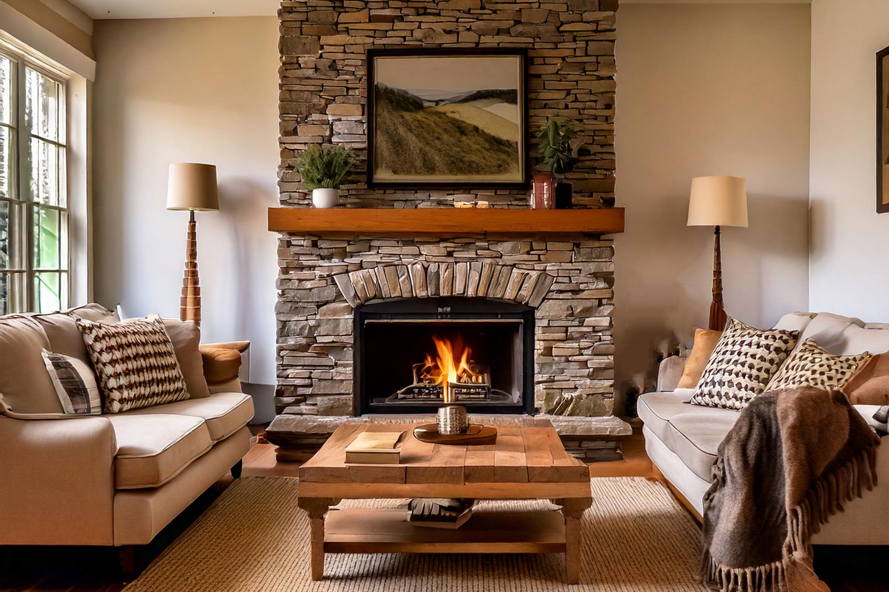
These evoke feelings of warmth, passion, and energy, like sunsets and cozy fireplaces. These colors are perfect for spaces where you want to create a lively, inviting vibe, like kitchens or family rooms. - Cool Colors: Blues, greens, and purples.
These colors remind us of water and the sky and create a soothing, calming effect. Again, a great choice for spaces like a bedroom or study.
When selecting colors, think about the mood you want to set in each room.
Do you want your living room to feel like a warm embrace or a cool retreat?
The answer will guide your palette.

Color Psychology and Color Harmony
One of the most common questions when it comes to home decor is: How do I ensure my colors don’t clash?
Well, color theory has this covered. Here are a few trusty formulas to create harmony in your home:
- Complementary Colors: These are colors directly opposite each other on the color wheel, such as red and green, or blue and orange. This high-contrast combo is bold, dramatic, and perfect for those wanting a vibrant, dynamic look.
- Triadic Colors: This scheme uses three colors evenly spaced around the color wheel. Think red, yellow, and blue. The key to making triadic colors work is balance—consider using one dominant color and the other two as accents.
- Analogous Colors: These are colors next to each other on the color wheel, such as blue, blue-green, and green. These are perfect for anyone who loves a more blended, unified design.
- Monochromatic Colors: For those who prefer simplicity, a monochromatic scheme uses varying shades and tints of a single color. This approach brings elegance and unity to a room without feeling overwhelming.

Color Psychology: Practical Application Tips
Even with all that knowledge of color theory and color psychology, picking colors for your rooms can still feel a bit overwhelming.
Here are a few practical tips to help you confidently implement your newfound knowledge:
1. Start with Neutral Bases
When in doubt, begin with neutral walls or furniture, then layer in pops of color with accessories like throw pillows, rugs, or artwork. This gives you flexibility and allows for future changes without a complete overhaul.
2. Experiment with Textures
Color isn’t the only way to add dimension to your space. Incorporating different textures—like velvet pillows or a rough-hewn wooden coffee table—can give a room more depth and interest without relying on bold colors.
3. Get Color Inspiration From The Seasons
There are many great examples of color psychology in action in nature, so why not take some inspiration from nature?
I love natural tones, like sage green, earth brown, and sky blue, and feel they can create a grounding, serene atmosphere inside your home.
A natural tone also gives you room to bring in new colors with every season. If you love adding seasonal vignettes and changing decor to compliment the outdoors, this is a great pick for you.
Alternately, you can embrace the season and get inspired by it. Like this deep winter color scheme that makes your house feel warmer.
Ready to level up your design game? We’ve got tons more Design Element Projects just waiting to spark your next big idea. Dive in!
4. Mix Warm and Cool Tones for Balance
Striking a balance between warm and cool tones in one room can create a harmonious effect. For example, if you have cooler gray or blue walls, you can add warmth with some earthy accents like terracotta planters.
This helps create a space that feels inviting without being overly stimulating.
Remember, color psychology is so important that it is used in marketing and branding, as it can influence the way consumers perceive a brand or product. So you use it wisely and to your advantage.

